Just a few notes on the evolution of the EM logos.
I’m a little more hesitant when going to Barbrook Cottage
these days. I always seem to come back with more than I went with, and I
don’t just mean cow dung on my car tyres and boots!
Celia and I were up there last summer and someone, lets just call
her KC, gave Celia a folder of children’s drawings with a request to
check these over and see if there was anything which would sow the seed
of a logo for Eastern Moors. As a retired art teacher Celia would have
knowledge of such things!
Although the art was good in itself, we
were unable to use these as a basis for a logo. Thus it was that ‘yours
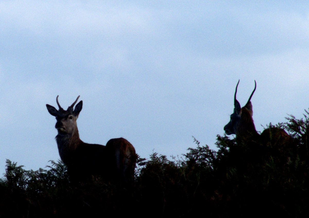
truly’ was sent out, with camera, to look for inspiration. Our brief
was to reflect the moors, its history, its wildlife and its use by
enthusiasts..
Here are a few of the first thoughts -
To fit all this into one logo would make it more complicated than the Royal Coat of Arms and it was decided that a maximum of 4 individual logos would be the answer
So it was that the design process began. Surprisingly the shapes for
the ‘adder’ and ‘rock art’ sorted themselves and even the ‘red deer’
caused not too much heartache! It was decided that a group of deer
would be more family friendly than a dominant stag with massive antlers.
But the human activity! Where to start? Walking, cycling, running, rock climbing, horse riding, photography, orienteering, bird watching, deer stalking….. The list goes on.
From a practical point of view we only had one colour to play with and this would be a silhouette overlaid on the colour of the shirt. 3D work was therefore out of the question as it is difficult without 3 colours! So why the rock climber?
To start with this image enabled us to incorporate an Edge which is one of the main features of these moors. It also gives the sense of space and adventure. I am sure the powers that be would consider other sports or pastimes in the future but the climber for now ticks as many boxes as possible.
By placing 2 of the motifs against the setting sun we added to the sense of drama for these Moors and lightened up the whole image.
The original concept was for 4 individual designs and then allowing the choice of 4 tee-shirt colours - green, purple, grey and pink!
By now our amateur work had been handed over to the professionals and it was becoming clear that there were far too many options. With a degree of relief in some quarters, the pink was dropped and it was an inspired act to put all 4 designs together.
15 months later we now have the final product. We hope you agree that the effort has all been worthwhile and that you will wear the shirt with pride when out and about!
Roger November 2014


